
VISUAL BRANDING
PROJECT OVERVIEW
Evercoat’s OPTEX® body filler and putty help take the guess work out of the application process. Once mixed with cream hardener, Evercoat’s OPTEX® products change color from a shade of pink to green, letting the body shop technician know that the repair is properly catalyzed and ready to sand. With the launch of the Lite Weight OPTEX® and Z-Grip® OPTEX® body fillers, the OPTEX® family now encompasses a larger collection of products that makes color-change solutions possible for every shop.
ROLE
This project was a team effort in collaboration with the marketing manager and digital marketing specialist. My role as the designer included visual design direction, strategy, and ideation.
STRATEGY
With more products being added to the OPTEX® family, a unique and consistent visual identity for Evercoat OPTEX® should distinguish OPTEX® products from other Evercoat brands across all marketing touchpoints.
DELIVERABLES
VISUAL IDENTITY DEVELOPMENT
Previously, the only existing design elements that visually distinguished OPTEX® products from other Everoat brands was the OPTEX® logo and the Green Means Go icon. This icon was commonly used throughout marketing materials to promote the color-changing technology that OPTEX® products are known for.

To successfully evolve the visual identity of the OPTEX® brand, these elements were required to stay consistent as customers were already familiar with this imagery. The implementation of additional design elements successfully enhances the existing logos, giving OPTEX® a more modern and sophisticated visual presence.
Z-GRIP & LITE WEIGHT OPTEX®

The launch of Z-Grip OPTEX® and Lite Weight OPTEX® color-changing fillers presented the first opportunity to showcase the newly evolved visual identity of the OPTEX® brand.

The package design incorporates familiar elements of OPTEX® as well as redesigned versions of the Z-Grip and Lite Weight logos, giving the products a more sleek and modern presentation.


These elements were also applied to additional launch deliverables including emails, landing pages, and web pages.
CATALOG DESIGN
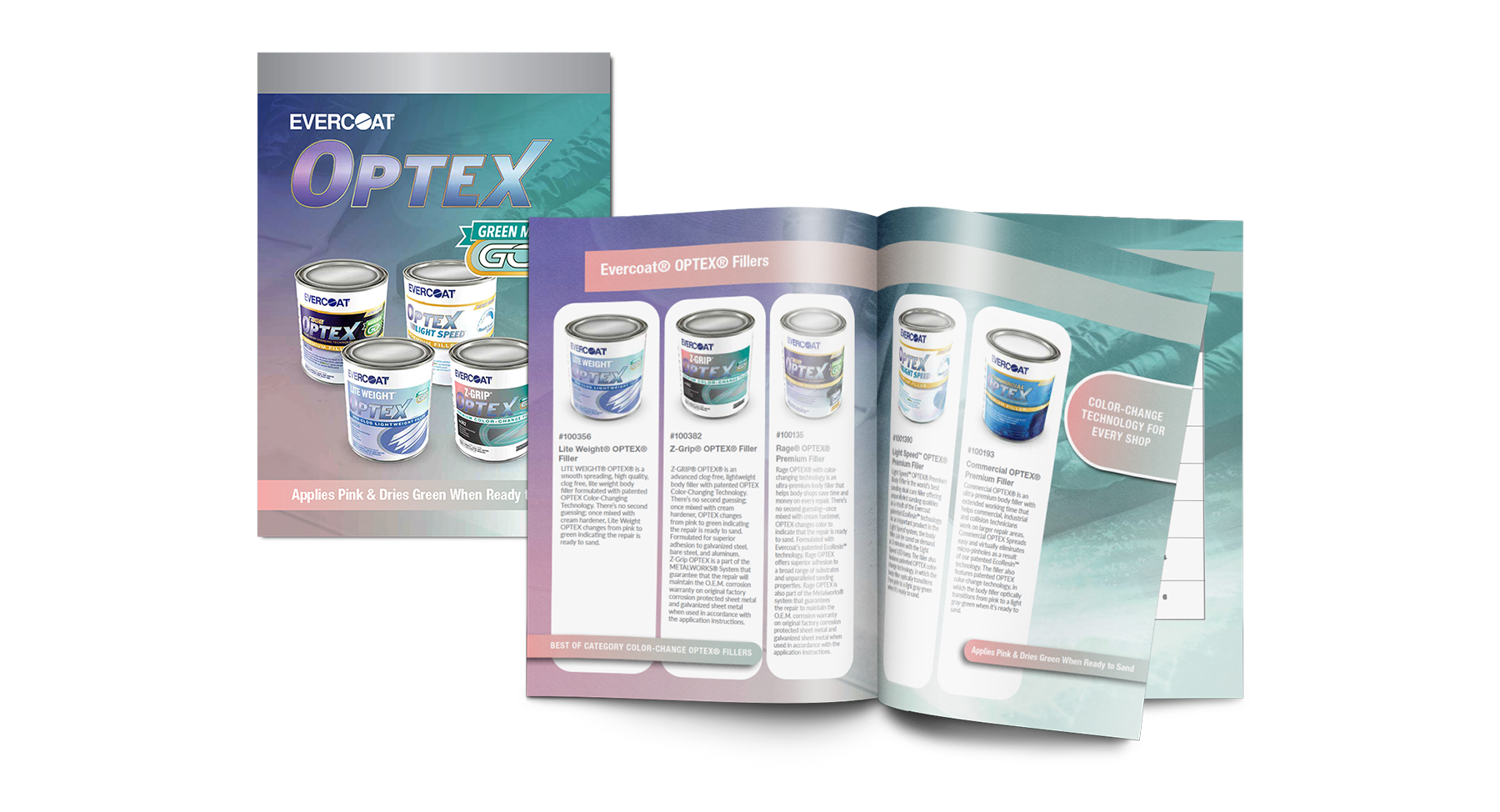
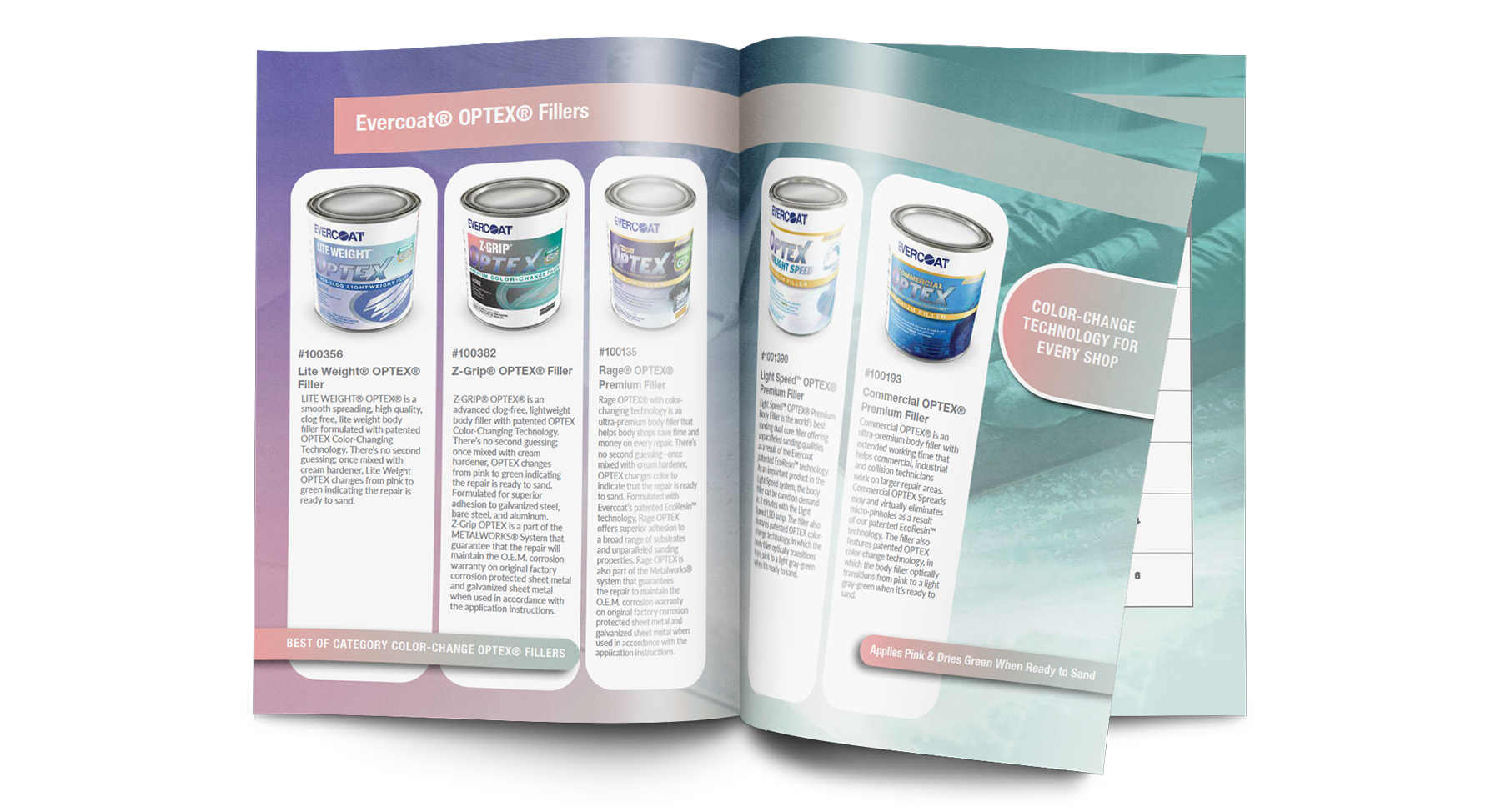
The design of the OPTEX® product catalog combines visual elements from traditional OPTEX® products along with the newly developed design of Lite Weight and Z-Grip. The OPTEX® product family now share a unique and consistent visual identity across the product catalog and other marketing platforms.
TRADE SHOW DESIGN
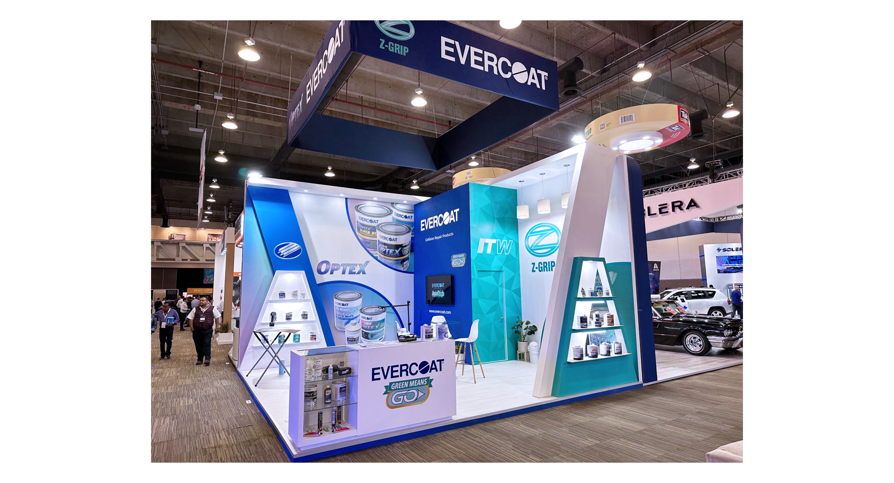
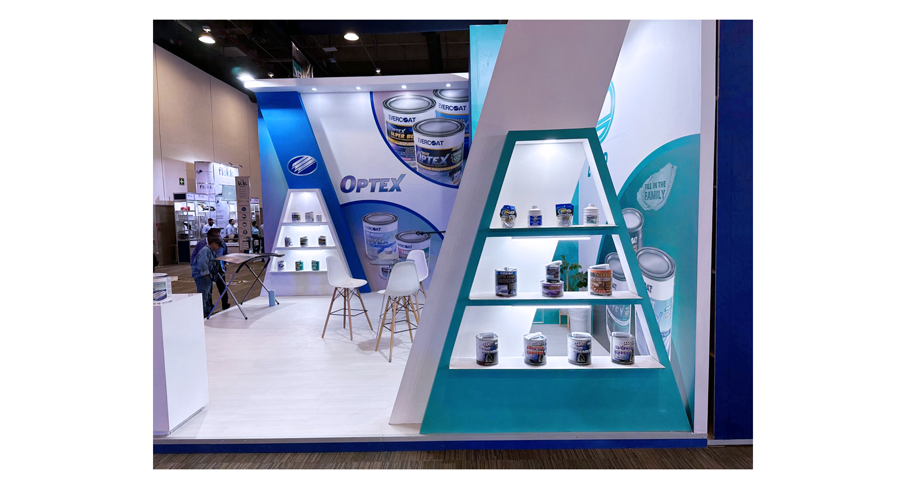

Successful application of the updated OPTEX® branding has also been implemented into existing trade show displays and structures, further enforcing the brand’s visual identity to event attendees.